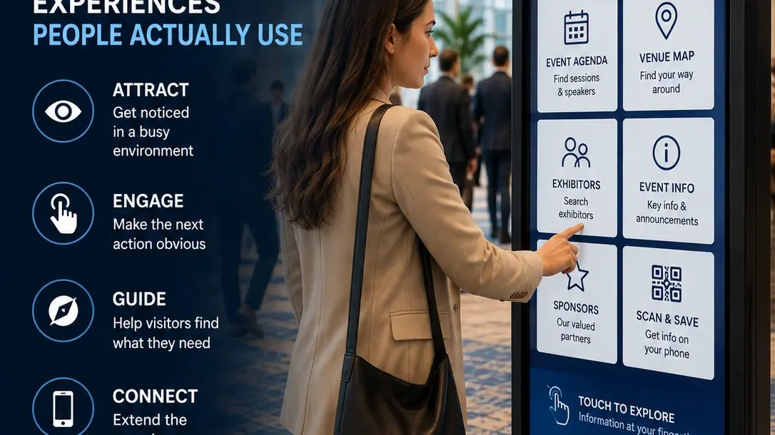
An interactive kiosk can have great content, powerful software and a beautiful touchscreen—and still go unused.
The challenge isn't simply putting technology into a physical space. It's designing an experience that people can notice, understand and use without instruction.
Whether a kiosk is helping conference attendees find sessions, trade show visitors explore products, venue guests navigate a property or customers find information, successful interactive experiences have something in common:
The next action is obvious.
Here's how to design for that.
Start With One Clear Purpose
Before designing screens, define what the kiosk is supposed to help someone accomplish.
That might be:
- Find a destination
- Search an event agenda
- Explore exhibitors
- Browse products or services
- Find a meeting room
- Complete a survey
- Submit an inquiry
- Check in
- Request information
- Continue content on a mobile device
A kiosk can support several functions, but it should still have a clear reason for existing.
If the project begins with:
“We have a touchscreen. What should we put on it?”
the experience is already being designed backward.
Start instead with:
“What does the visitor need to accomplish here?”
That question should guide the interface, content and technology decisions that follow.
Make the First Screen Immediately Understandable
People shouldn't need instructions from nearby staff to understand a public kiosk.
The first screen should quickly answer:
What can I do here?
and:
Why should I interact with it?
Compare a generic instruction such as:
Touch Screen to Begin
with something more useful:
Find Your Session
Explore Exhibitors
Find Your Way
Explore Our Products
The second approach communicates value before interaction begins.
Most people encounter a kiosk while they're already doing something else—walking through a lobby, attending an event, exploring an exhibit or trying to find a destination.
You may have only a few seconds to communicate why the interaction is useful.
Design for a Standing User, Not a Desktop User
A kiosk isn't simply a large desktop computer.
Visitors may notice it from several feet away and move closer only after deciding that it is relevant.
That changes how the interface should be designed.
Viewing distance. Can someone understand the kiosk's purpose before reaching the screen?
Text size. Is important information readable in the actual physical environment?
Touch targets. Are buttons large enough to select comfortably?
Screen orientation. Does the interface work naturally in portrait or landscape?
Reach. Are important controls positioned where users can comfortably access them?
Lighting. Does the interface maintain sufficient readability and contrast under venue lighting?
Whenever possible, test the experience on the actual display size and orientation, not only on a laptop.
Make Touch Targets Obvious
One of the most frustrating kiosk experiences occurs when users can't tell what is interactive.
Buttons should look like buttons.
Selectable cards should look selectable.
Navigation controls should remain visually consistent.
Avoid forcing visitors to experiment simply to discover what they can touch.
Interactive elements should also provide immediate feedback.
When someone taps a button, something should visibly happen—a state change, screen transition, highlighted selection or other confirmation.
Without feedback, users may tap repeatedly because they aren't sure whether the system registered the interaction.
Reduce the Number of Choices
More options don't automatically create a better experience.
Imagine a conference kiosk presenting fifteen equally prominent choices on the first screen.
The attendee now has to stop and interpret the interface before doing anything.
Instead, organize the experience around the most common visitor objectives.
For example:
Today's Schedule
Find a Session
Explore Exhibitors
Venue Map
Event Information
Less frequently used functions can live deeper within the experience.
The first screen should prioritize what most visitors are likely to need.
Keep Navigation Predictable
Visitors shouldn't become trapped inside an interactive experience.
Provide clear and consistent navigation such as:
Home
Back
Start Over
These controls should remain in predictable locations.
If someone drills several screens into an exhibitor directory, for example, they should understand how to return to the directory or main menu.
Public interactive experiences should require very little learning.
Every unfamiliar navigation pattern increases the amount of thinking required from the visitor.
Design Short Paths to Common Tasks
Count how many interactions are required to accomplish the kiosk's primary objectives.
If someone wants to find a breakout session, should the process really be:
Home → Event → Agenda → Day → Track → Session → Location?
Probably not.
Common tasks should have short, direct paths.
This becomes especially important at conferences, trade shows and public venues where visitors may already be in a hurry.
The kiosk should reduce friction, not create another process attendees need to navigate.
Use Search When Browsing Becomes Difficult
Some information sets are simply too large for basic menus.
An exhibitor directory containing hundreds of companies is one example.
A multi-day conference agenda with dozens of sessions is another.
In these situations, search and filtering can make the experience significantly more useful.
Visitors might search by:
Company
Speaker
Session
Topic
Product
Room
Destination
Search itself should also be designed for touchscreen use.
Keep input requirements minimal and use useful categories or filters when they can reduce the amount of typing required.
Design Content for Quick Consumption
Kiosk visitors usually don't want to stand and read long pages of text.
Organize information into content that can be understood quickly.
Use:
Clear headings
Short descriptions
Strong visual hierarchy
Images where useful
Concise calls to action
Detailed information may still be valuable, but consider whether the visitor really needs to consume all of it at the kiosk.
Sometimes the better experience is to help someone discover information on the larger display and then continue on their own device.
Connect the Kiosk to the Visitor's Phone
Interactive kiosks and smartphones can complement each other.
Someone might discover information on the kiosk but want to take it with them.
A QR code can provide a useful handoff for:
Directions
Product information
Session details
Downloads
Web pages
Contact information
Follow-up forms
For example, a conference attendee could find an exhibitor on a kiosk, view its location and then scan a QR code to continue with the information on their phone.
The important principle is:
Give people a reason to scan.
A QR code without a clear benefit is unlikely to create meaningful engagement.
Know When a Kiosk Shouldn't Be Interactive
Not every digital display needs touch capability.
If visitors simply need to see:
Welcome messaging
Schedules
Simple directions
Announcements
Sponsor recognition
a standard non-touch display may be the more appropriate solution.
Interaction adds value when the visitor needs to:
Search
Choose
Explore
Enter
or
Submit
information.
Choosing the simplest technology that solves the visitor's problem often creates the better experience.
Plan for Inactivity and Session Reset
Public kiosks are shared devices.
What happens when someone walks away in the middle of an interaction?
The next visitor shouldn't inherit the previous person's session.
After an appropriate period of inactivity, the experience should return to a safe starting state.
Depending on the application, that might mean:
Returning to the home screen
Clearing a search
Closing an open form
Removing entered information
Restarting the attract screen
This becomes particularly important when visitors can submit information.
Protect Visitor Information
If a kiosk collects names, email addresses, survey responses or other information, privacy should be part of the experience design.
Don't leave completed forms or personal information visible for the next user.
Forms should clear after submission.
Sessions should reset.
Only collect information that serves a clear purpose.
And when an action would be more comfortable or private on the visitor's own device, consider handing that part of the journey off through a QR code.
Consider Accessibility From the Beginning
Accessibility shouldn't be something added after the interface is finished.
Consider:
Readable text sizes
Adequate contrast
Clear language
Appropriate touch-target sizes
Reachability
Navigation consistency
Alternative methods where appropriate
Physical installation matters too.
A well-designed interface can still be difficult to use if the screen or important controls are positioned poorly.
Placement Is Part of the Experience
Where a kiosk is installed affects whether people use it.
Consider:
Visibility. Can visitors easily see it?
Context. Does its purpose make sense at that location?
Traffic flow. Can someone stop and interact without blocking a corridor?
Decision points. Is the kiosk available when someone actually needs the information?
Power and connectivity. Can the experience operate reliably there?
An interactive wayfinding kiosk positioned after visitors have already made their navigation decision isn't particularly useful.
The physical environment is part of the user experience.
Interactive Kiosks at Conferences
Conference attendees regularly need to find information in unfamiliar environments.
Useful applications can include:
Searchable agendas
Session lookup
Speaker information
Interactive maps
Wayfinding
Exhibitor directories
Sponsor information
Surveys
Event information
The right combination depends on where the kiosk is located and what attendees need at that moment.
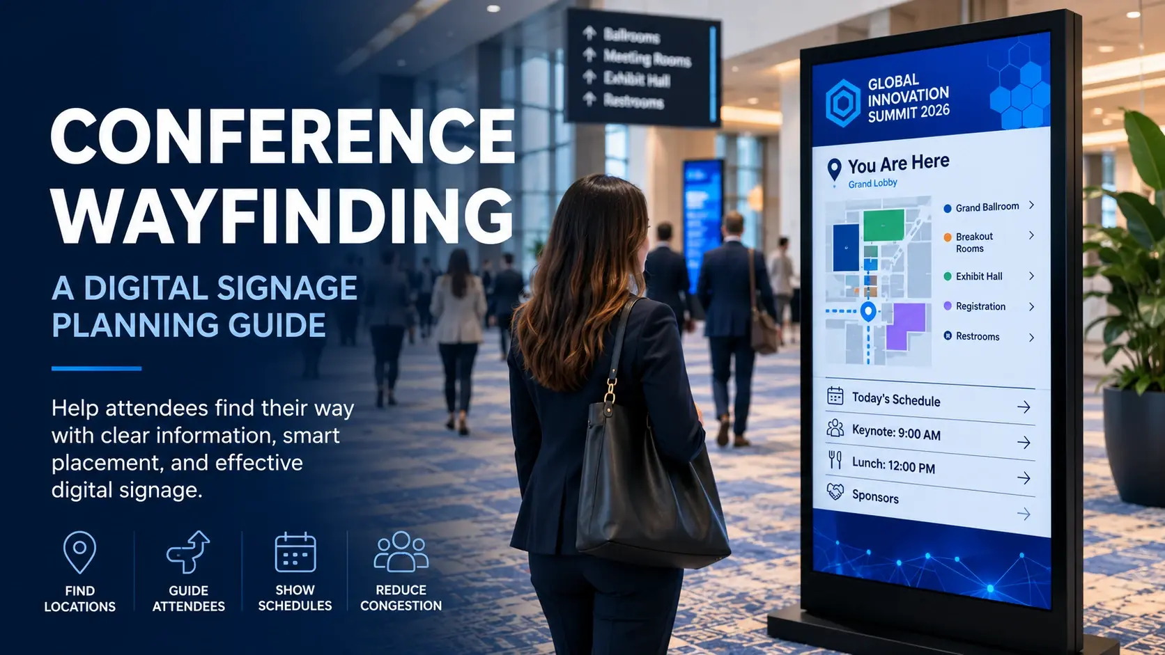
For conference navigation specifically, see our Conference Wayfinding: A Digital Signage Planning Guide.
Interactive Kiosks at Trade Shows
Interactive displays can give trade show visitors another way to engage with an exhibitor.
Applications might include:
Product exploration
Product comparison
Interactive demonstrations
Video libraries
Solution finders
Lead capture
Content handoff
The kiosk doesn't need to replace booth staff.
Instead, it can support the conversation or provide a self-directed way to explore when staff members are occupied.
Measure Outcomes, Not Just Touches
A kiosk can generate a large number of interactions without accomplishing anything useful.
Measurement should relate to the purpose of the experience.
For wayfinding, useful measures might include:
Destination searches
Map views
Directions accessed
For product exploration:
Products viewed
Content accessed
QR handoffs
Inquiries submitted
For an event:
Sessions searched
Exhibitors viewed
Agenda interactions
Start with the desired outcome and determine what visitor behavior indicates success.
A high number of screen taps isn't necessarily success.
Design Around the Customer Journey
An interactive kiosk is one touchpoint within a larger experience.
Someone may discover the kiosk, interact with content, scan information to their phone, speak with a representative and continue the journey later online.
That means kiosk design shouldn't be considered in isolation.
Our guide Designing Interactive Digital Experiences Around the Customer Journey explores how interactive technology can support the broader progression from discovery through engagement, exploration, action and continued interaction.
Planning an Interactive Kiosk Experience?
Start with the visitor.
Ask:
Who will use it?
Where will they encounter it?
What are they trying to accomplish?
What is the simplest interaction that helps them accomplish it?
Then choose the hardware, interface and content around those requirements.
iMediaSign provides interactive kiosk and touchscreen solutions for events, venues and organizations, including event information, directories, wayfinding, product exploration and other self-service experiences.
Explore our Interactive Kiosks solutions to see where interactive technology can fit into the broader visitor experience.